Friday, May 19, 2006

Creating Texture with Oil Sticks

This-28x24-(2004) painting looking South from Cascade Head on the Oregon Coast was painted using oil sticks. It was painted on a wooden panel which allowed me to push on the oil sticks to go through the previous layer. This gave the interesting textural effects. Clicking twice on the painting will allow you to see more or the texture. (artist's collection)

Non Representional Painting


This-painting is 48x42 done in oil. I did it a couple of years ago in Mexico. I find non-representational painting a challenge. At the start I am confronted with this huge white canvas and complete freedom. Usually I have some idea of the colors I want to use and perhaps some sense of forms. It is all struggle from there. I have found books on how to paint abstractly are next to useless. Looking a lot at what others have done helps a lot. I did this one after looking at some of Richard Diebenkorn's early abstract expressionist paintings - the ones before his figurative period and the Ocean Park series. One thing that helps is repetition but always with a difference. In this painting the shapes are all more or less rectangular and horizontal but they differ in placement, size and color and in their irregularity. I pay attention to try to make adjacent colors make each other "sing". The charcoal lines add more texture and interest. Keeping the palette simple helps me. All of these issues are important in more representational painting and I think the experience of painting abstractly improves my plein air landscapes. That said, my most satisfying painting experience is creating an abstract painting that works. The size, the colors, the shapes enchant me when they work. (2004) (artist's collection)

Painting With Encaustic


Encaustic-is oil based paint mixed with wax (usually bee's wax) and varnish to make a semi-solid paint when cold or liquid when used hot. In either case it dries over time to a very hard surface. The technique dates back to ancient Egypt. Because it is quite thick you can achieve marvelous texture with it. This large painting of an apple orchard is 36x48 painted on a birch panel. (approx. 2001) Collection of the artist.

Mailboxes as an interesting subject

This-is-my-parking lot at our home. My friend, Susan Monti, showed me the utility of mail and newspaper boxes in her paintings. Everything you need it right there, blue mailbox, red flag and yellow newpaper box. 32x32 Oil on canvas. (2003) Artist's collection.

Thursday, May 18, 2006

Luncheons at Helen's

I-paint-with-Helen Kroger, Susan Monti and Susan Dale on Wednesdays in the summer. This is Helen's home near Wilsonville, Oregon where we meet to paint. I was learning to paint rocks and I could not resist the pile in Helen's yard. This painting recalls for me our camaraderie and our weekly gourmet pot luck lunches 28x24 (2003) o/c (artist 's collection)

Getting up and going to work.

Chuck-Close-said "Amateurs look for inspiration; the rest of us just get up and go to work". That is how I felt walking out my front door and painting my front steps. In this painting I am doing a pretty good job of painting shapes rather than things. The colors were kept bright by using a palette of primary colors plus green. 28x24 oil on panel (artist's collection).

Painting with Style

Here-I-enjoyed stylizing - especially the repeated curved lawn areas in the foreground, the dark outlined shrubs and the white tree trunk. Originally I had included the windows of the house and the foliage on the foreground tree but I did not like the fussiness and eliminated them to create simple planes and lines. Oil paint sticks on pannel, 24x28 (2004) (artist's collection).

Painting at Sitka

Sitka-Center-is-located on a beautiful site at the base of Cascade Head on the Oregon Coast. The center hosts workshops in art and the environment. Friends generously loaned me their cabin, seen on the right, so that I could paint and assist my mother in law, Ann Perkins, while she took classes. She was still painting at age 90. The white barked tree is what intrigued me and led to this painting. I had included a railing on the deck originally - removing it make for a much better painting. It is 32x32 painted in oil on canvas. I love the rich earth colors against the white trunk. (2003) (artist's collection)

Cezanne's Trees

I-love-the-shape of the pines you find in southern Spain and France. I found the general shape of the pine tree crowns in a black and white photo of a Cezanne in the Hermatage. I used paint sticks on top of an encaustic under painting. The paint sticks provided a lot of texture when scribbled over the rough encaustic. The painting is 36x44 painted on birch panel (2004) (artist's collection).

Fun with Matisse

This-is-a-large and fun-painting (48x40). Matisse and I have the same initials (H.M.) so I signed it HM in the lower left corner. Matisse of course painted "The Red Studio" so this is a take off on that. I needed something in the right lower corner and it took a long time before I thought of his signature gold fish bowl. I looked at a lot of his paintings that included one. The bowls were always round and when I tried one it clashed with the otherwise totally rectilinear painting so eventually I invented the rectangular fish bowl. (2004 o/c) (artist's collection)

Pentimenti

Like-many-of my favorite paintings this was an evolution of failed experiments each leaving a little evidence in the final work. This was painted in oil on canvas in Mexico in early 2005. It is 44x52 (artist's collection).

Painting in Series I

This-is-the first of a series of paintings I painted in the summer of 2005 from one site. Two of the subsequent paintings are shown below and the rest elsewhere on the blog. The prior summer I had used a lot of yellow ochre and raw umber and I opted for a brighter and simpler palette. I chose a warm and cool version of each of the primary colors substituting green for the warm blue. The reds here are cadmium red light and quinacridone red. You can see the quinacridone in the sky. I also used cadmium lemon and cadmium yellow medium, ultramarine blue and viridian green. With this palette you must intentionally mix all unsaturated colors. The whole series was painted on 24x28 panels. This is the most detailed of the six paintings. With subsequent paintings I tried to see what could be removed or abstracted. (artist's collection)

Painting in Series III


This-is-the third of a series and the only one not painted on site. In the studio I decided to see what would happen if I eliminated the barn altogether. I copied the prior painting replacing the barn with the open field. 24x28 o/p (2005)

Painting in Series IV


This-is-the fourth of the series of plein air paintings from the same site. On the basis of the satisfying results when I removed the previous focus of interest, the barn, in this version I omitted the barn, fences, telephone poles and foreground foliage. I also simplified the background trees to mere shapes. This is my favorite of the series. It hangs in my Portland living room. I particularly like the colors in the road, which came from scraping down repeated failures, against the green fields. 24x28 o/p (2005) (artist's collection)

Saturday, May 13, 2006

The Pink Stairs

This-painting-was done 200 feet from my home in our community. The scene is fairly realistic but the colors are all mine. o/c (2003) (artist's collection)

Monday, May 08, 2006

Painting with the palette knife

This-painting was painted in oil using a thin flexible palette knife. This allowed spots of different hues to be intersperced creating a lively colorful painting. It helped to lay in the painting in intense color (straight out of the tube) keeping the value (lightness or darkness) and temperature (warm or cool) true to the scene. For instance to keep the value and temperature true, I used cadmium orange for the underpainting of the grass foreground. Pure green would have been too dark a value. I then overpainted with the local color (a lighter mixed green) using the palette knife and letting bits of the orange show through. This approach insures that the temperature and value will always be correct while the color can be varied and when desired intense. If the value changes you tend to get leopard like spots rather than an integration of the intense colors. Click twice on the painting to see the technique in detail. 24x20 o/p (2002) (artist's collection)

Under Painting

This-was-planned-as-an acrylic underpainting. However I liked it and decided I probably would not improve it by more painting. 34x24 acrylic on canvas (done in class about 2001) (artist's collection)

Getting there by simplifying

This-started as a plein air painting in oil. There were trees across the background hill, large foreground trees on the right and an attempt to render the white reflections in the rippling stream. I was not very happy with it. In the studio I went over the painting scribling with oilsticks eliminating all that and sprucing up the brown cabin with white walls, an orange roof and complement blue shadow. 28x24 o/c (2004)

Homage to Diebenkorn

Diebenkorn's-painting with this girl is on my studio wall. I love Diebenkorn's figurative work. I took the shape of the girl and developed my own painting around it. 32x28 o/c (2002)

Cascade Head


What attracted me to this view was the huge rocks at the water line. It-needed to be-painted in the afternoon when the sun was on Cascade Head. However the afternoon winds were so strong that they blew my French easel over. I moved behind a glass wall around a swimming pool to paint it. 36x36 o/c (2003) (private collection)

Planning for the proper sun

This-painting took more planning that I usually take. What really interested me was the white bark on the coast alders. I wanted them in sun. I needed to be on site at Cascade Head at about 7:30 AM when the sun came over the hill to the East. I set up an hour earlier to get it blocked in and be ready to capture the sun on the alder trunks as soon as it came. By 8:30 the sun was high enough that the alder foliage shaded the trunks. 32x32 o/c (2003) (private collection)

Zumwalt Cabin o/c (2003)

For-domestic tranquility this painting had to be done in one hour. My wife and I were on a car trip through the Nature Conservency Zumwalt Prarie in Eastern Oregon. My imagination envisions a pregnant woman with a round belly and full breast in this painting (this was not my intent while painting it). o/c (2003) (artist's collection)

Tuesday, May 02, 2006

About Me

"The real voyage of discovery consists, not in seeking new landscapes, but in having new eyes" Marcel Proust

After careers in medicine and computer science I took up painting in 1996 and went back to college as a full time student in studio art for five years. There I learned to paint and to see the world about me in new ways. I found that one can learn to draw - persistence is the clue. Teachers and students directed me to painters unknown to me. Often I could not make much of their work and yet in time they frequently became favorites - Milton Avery, Richard Diebenkorn, and Joan Mitchell come to mind among many others.

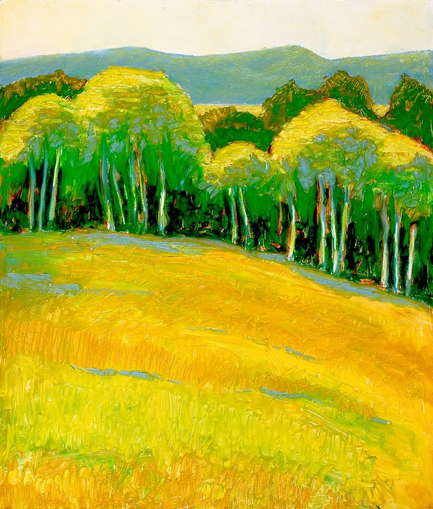
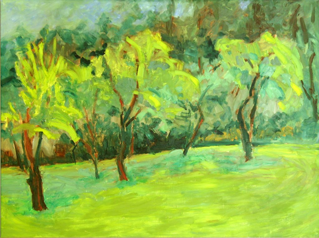
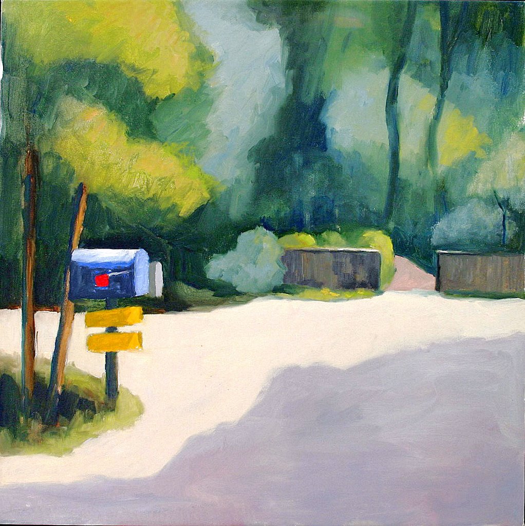
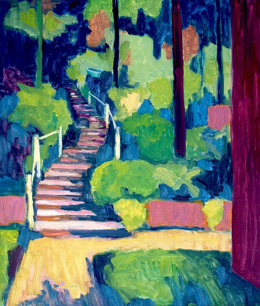
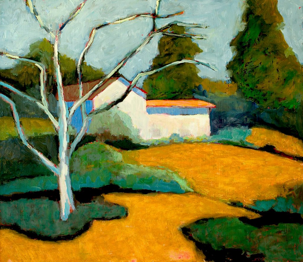
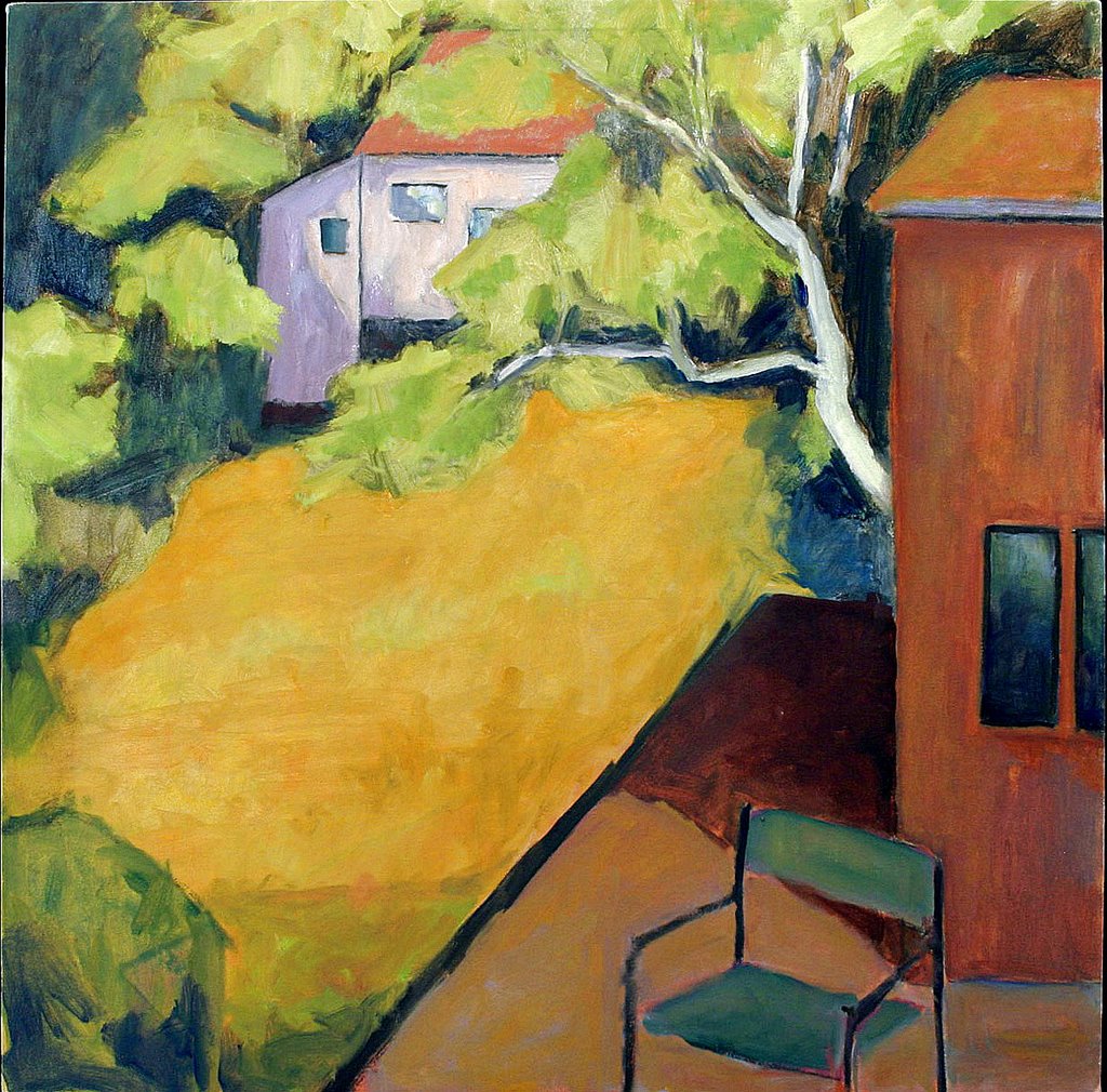
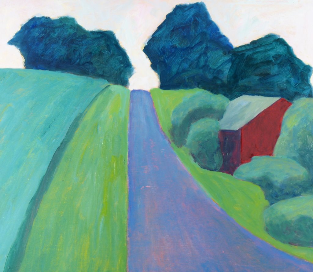
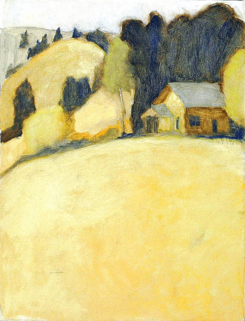
You can tell from my work that I am drawn to color and large shapes with little patience for detail. I find it interesting how one develops preferences that direct one's work without much awareness and how they eventually become a recognizable style. While some artists have a vision of their completed work before they start I seem to have to discover where I am going by just seeing what has to happen next. With my plein air paintings I almost always do a thumbnail value study however. I am fond of Chuck Close's comment, "amateurs look for inspiration, the rest of us just get up and go to work". Phillip Roth seems to have liked the quote also - I found it in two of his novels.

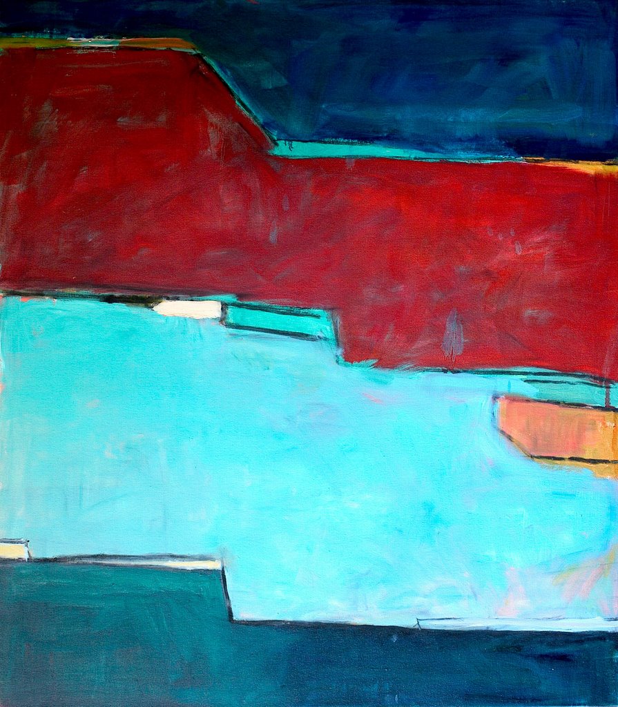
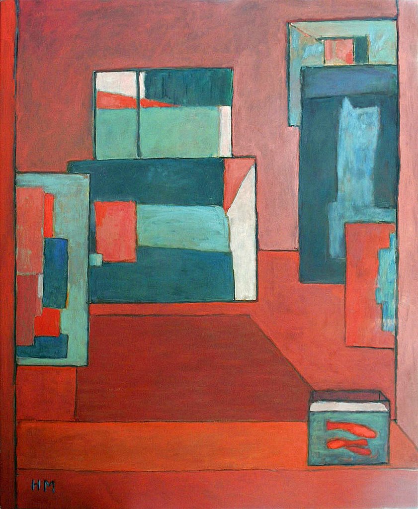
In summer I paint out of doors in Oregon, often with my friends, Helen Kroger, Susan Monti and Susan Dale when we share a wonderful lunch and critique. We show together each fall in Portland. In winter I paint in my studio in San Miguel de Allende, Mexico where most of my large abstract works are done.

I am pleased to be able to thank here the excellent teachers I have had at PCC, PNCA and PSU and especially Mark Andres at PCC from whom I took something like fifteen classes. Mark is special, an absolutely superb teacher and excellent artist. I also want to especially thank Sandy Roumagoux for her unending enthusiasm, support, joyous teaching and delightful art and Bob Dozano for his support even though I could never master water color and for showing up at our show each year.

I hope you will make comments. Click on the comment link to bottom right of any painting discussion to comment on the work or my notes or to see the comments of others. To make comments on the website as a whole click on the comment icon below at the bottom on this page.

To see more of my work:

March Archive of 31 more paintings

April Archive of 35 more paintings

Most of these paintings can also be seen at the sites below although there will be considerable redundancy at those sites.

McCartor Paintings (50 paintings sorted as landscapes, abstracts, figures - including some of those shown above)
McCartor Retrospective (90 paintings sorted by year painted)

I am grateful to Rusty Whitney for his care and expertise in photographing my 2003 and 2004 work. (WhitneyEventPhoto.com)

Hal McCartor

June 2006

6506 SW Barnes Road, Portland, OR 97225
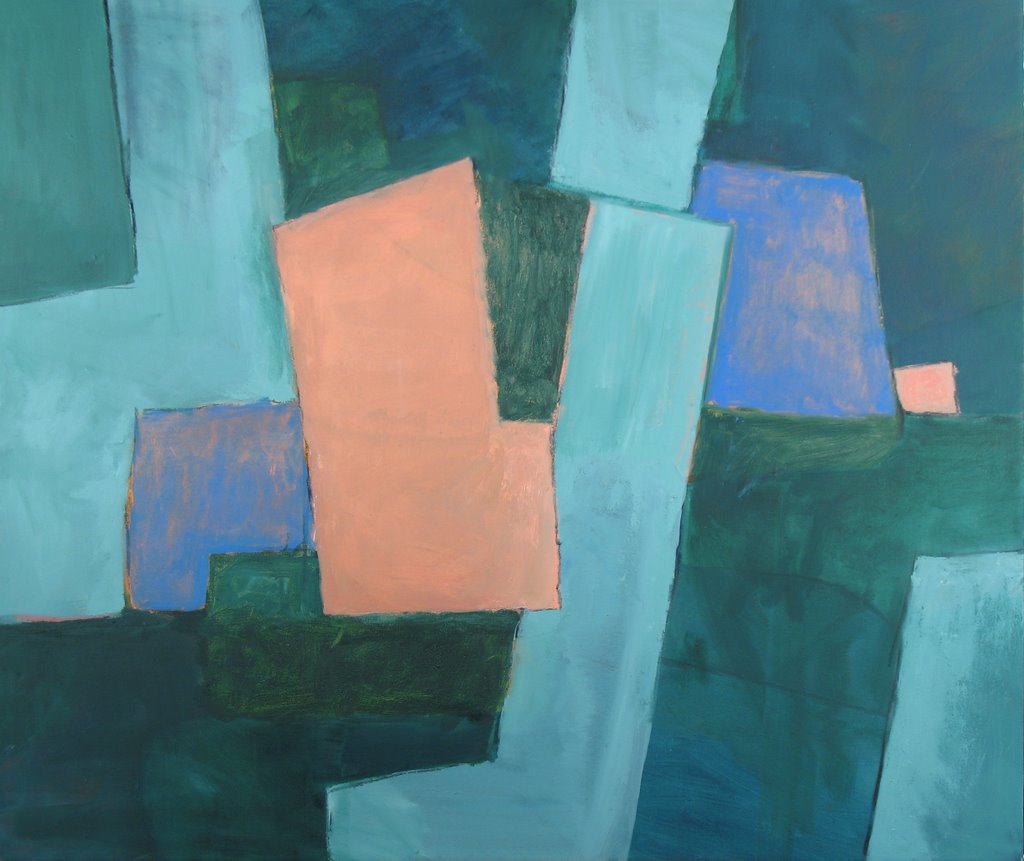
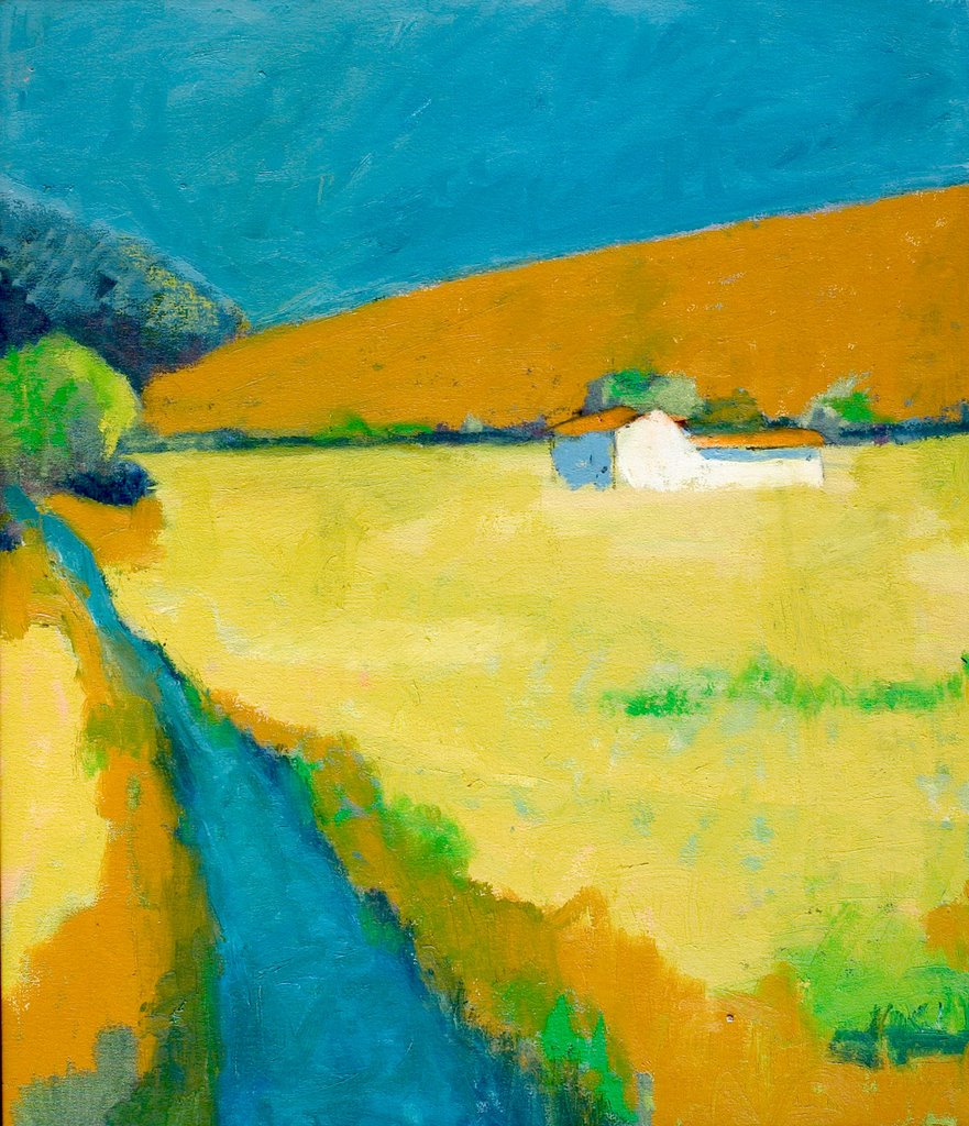
Monday, May 01, 2006

Looking at Diebenkorn

You-can-tell I had been looking at a lot of Richard Diebenkorn when I painted this. I only wish I could draw the way he did. This is 46x40 o/c (2001) (artist's collection)

Black Butte

Shapes-and-colors are the theme here. This is another painting where formal pattern and decorative colors predominate. 30x26 oil on linen (Aug 2006)

Painting on a Red Ground

This-painting-of-an-Oregon Hazelnut orchard was done on canvas primed with cadmium red light which you can see coming through. 26x30 oil on linen 2006

Another Version of Helen's Home

This-version-is from 4 years ago. 22x19 oil on canvas (2002). Collection of artist.

Texture in Abstract Paintings

Another-Mexico abstract. When painting something this simple in design the texture becomes very important. For this painting I slathered the canvas with an oil based thick gesso product which flowed down the canvas over a day or two. It took a week or two be get really firm. I also embedded string into this at the color boundaries. 48x46 o/c (2006) (artist's collection)

Painting in Series V


This-is-the fifth of the series of plein air paintings done from one site. Again using the experience of the an earlier painting I kept the abstraction and formalization while reintroducing the foreground elements. The main emphasis here is not on representation but on colors and shapes. 24x28 o/p (2005)